Torch
An AI recovery companion that turns the invisible daily work of recovery into something a person and their care team can see.
- Role
- Product and UX design, end to end
- Platform
- iOS and Android member app (Flutter) and web admin console
- Status
- In development with a US healthcare founder. Not released yet.
- Scope
- About 100 screens: 80+ in the mobile app and 16+ in the admin console, on one token-based design system
The brief
Help people in early recovery see their progress every day, and give their counselors a view between sessions.
Days sober is the number everyone tracks, but the daily work behind it is invisible: mood, cravings, sleep, therapy and meetings. Neither the member nor their counselor can see how a week is really going, and help at a bad moment is scattered across meetings, groups and crisis lines.
I owned the design end to end for a US healthcare founder: product flows, information architecture, the design system, the mobile app for iOS and Android and the web admin console.
What made it hard
- Fragile users. Early recovery is a vulnerable time. A screen that feels like paperwork or judgement costs trust, and people stop coming back.
- Sensitive data. Recovery and health data needs honest privacy at every step, from health permissions to who can see what.
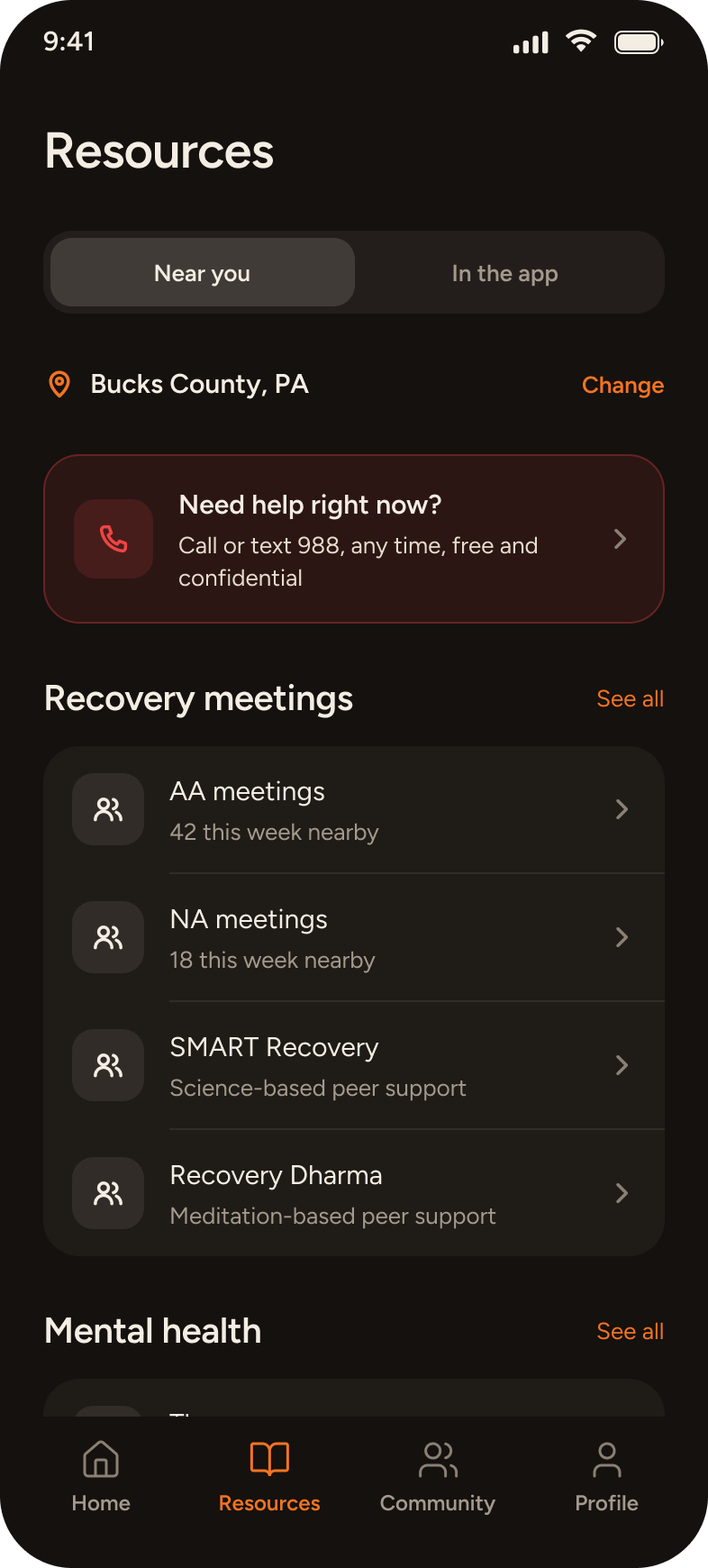
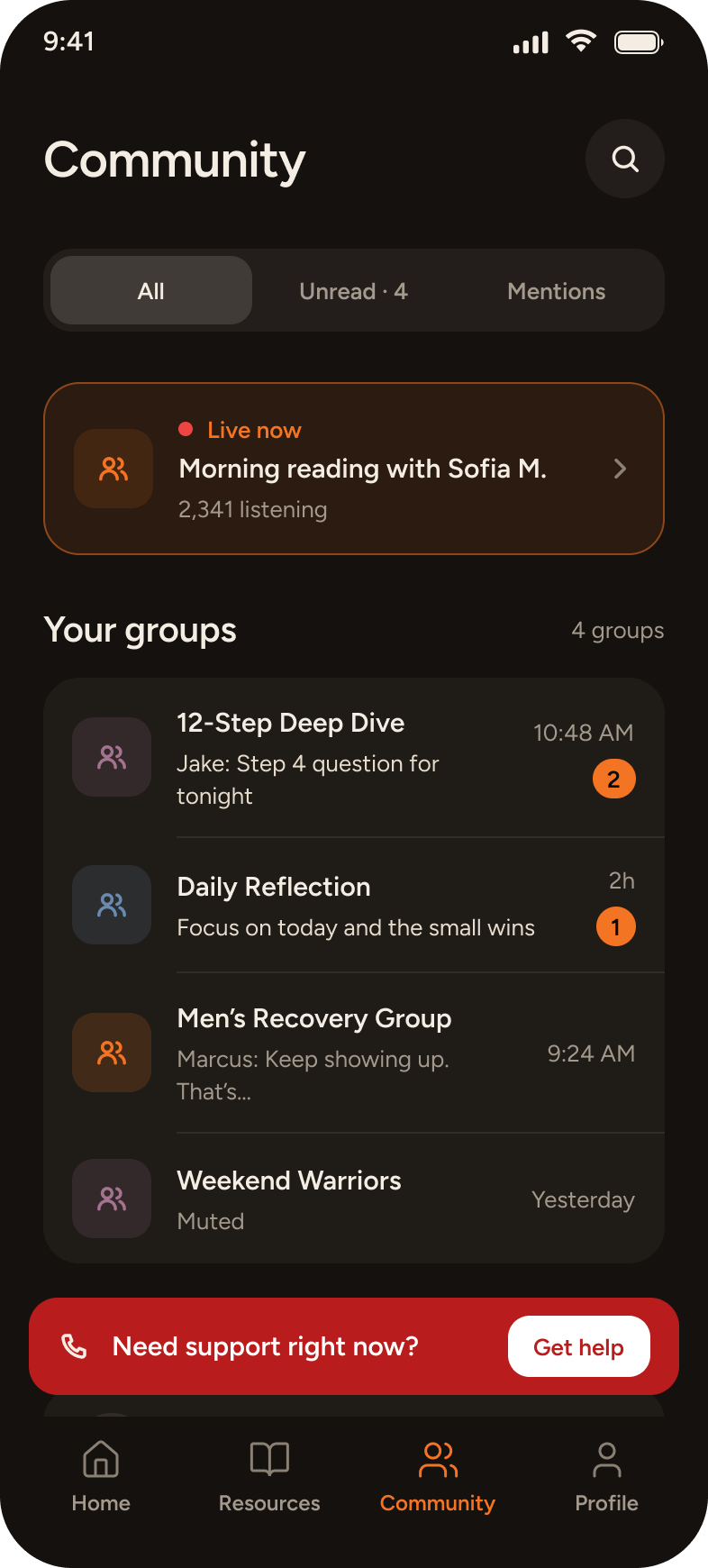
- Safety first. Someone in crisis has to reach help in one tap, whatever else is failing, including the AI.
- Two audiences, one system. Members need calm and encouragement. Counselors need dense, scannable data. Both share one design system.
What early research changed
I ran discovery interviews with 5 licensed addiction counselors and 6 individuals in active recovery. Three findings directly shaped the design:
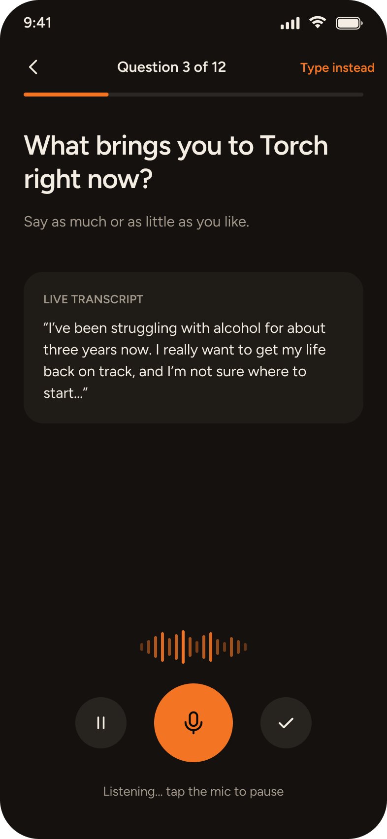
- Clinical forms trigger avoidance. Standard multi-page intake surveys felt punitive and caused high anxiety. Turning intake into a guided, pauseable voice conversation with Thea removed the clinical intimidation factor.
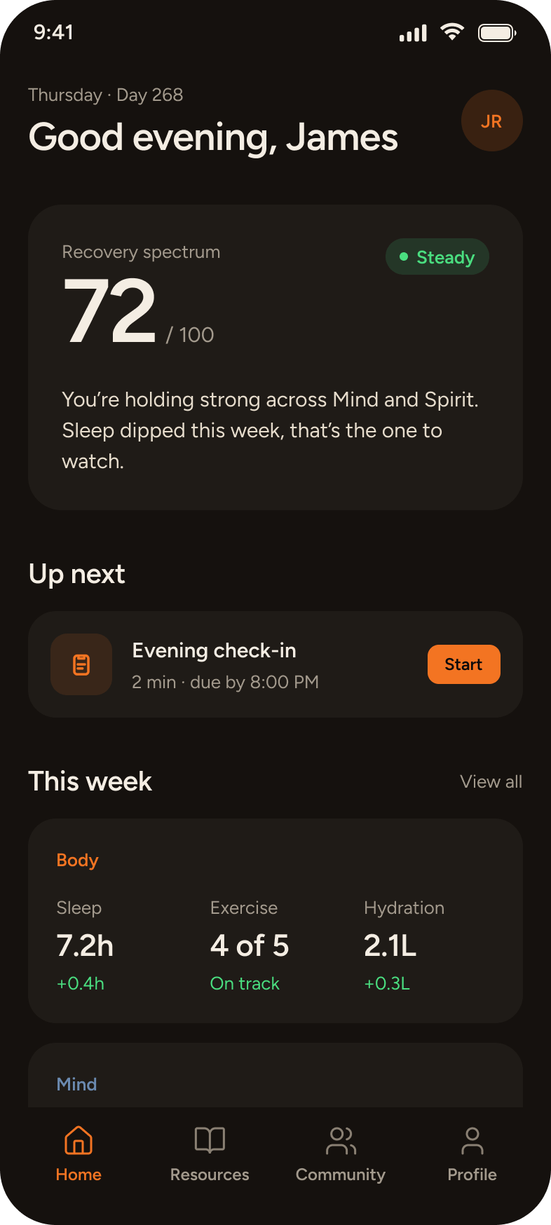
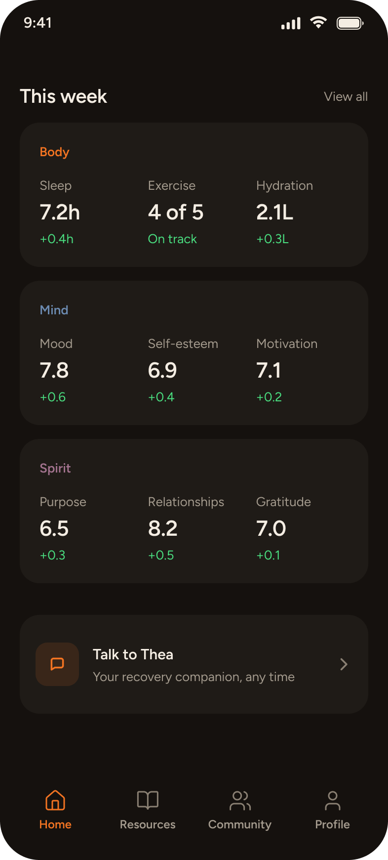
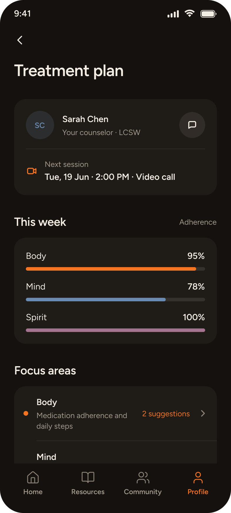
- Streaks create all-or-nothing despair. Tracking only "days sober" induced severe shame after a single slip, often triggering full relapse. Splitting progress across Body, Mind and Spirit gave members a way to recognise continuous daily effort even on hard days.
- Counselors need rapid triage, not data dumps. Counselors had an average of 3 to 5 minutes between back-to-back client sessions. They didn't have time to parse transcripts; they needed instant risk chips, check-in streaks and 7-day trend highlights.
Decisions
Conversation instead of forms
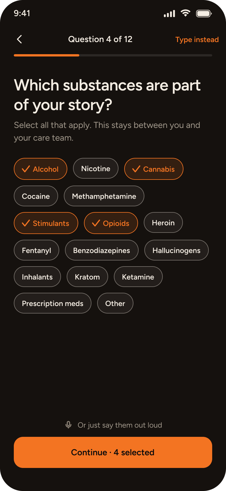
A long clinical questionnaire is the wrong first impression for someone in early recovery. Thea, the AI companion, asks the questions and the member simply talks, with typed chat for anyone who prefers it. Intake takes about 15 minutes and can be paused at any point. The answers become the member's recovery profile.
One score, three pillars the member chooses
Home leads with a single Recovery Spectrum score, then Body, Mind and Spirit. Members pick three metrics for each pillar, so the dashboard reflects what matters to them rather than everything the app can measure. Pillar colours are reserved for pillars, so they never take on a second meaning.
Help never waits on the AI
The route to 988 and the Crisis Text Line is a fixed path, always one tap away, and it works even when the AI doesn't. Try it in the demo above: switch the AI off and the help line stays.
Privacy said plainly, where it matters
Trust is earned at the moment of asking. The health data screen connects Apple Health on iPhone or Health Connect on Android, and states that access is read-only and that Torch never writes to or shares that data. The intake screen states that answers are private to the member and their care team.
Navigation that becomes muscle memory
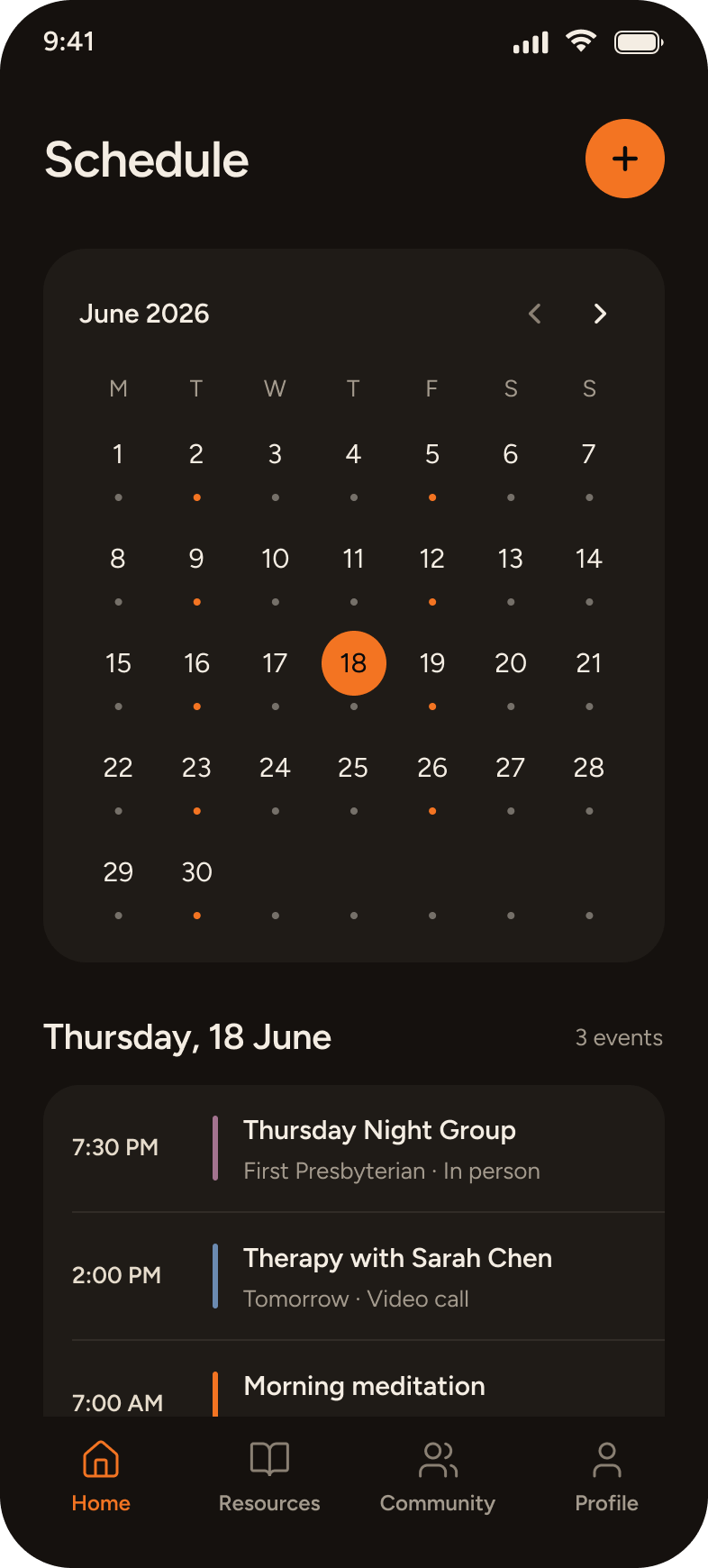
Flows stay short, and the tab bar keeps the same four items in the same order on every screen: Home, Resources, Community, Profile.
The admin console
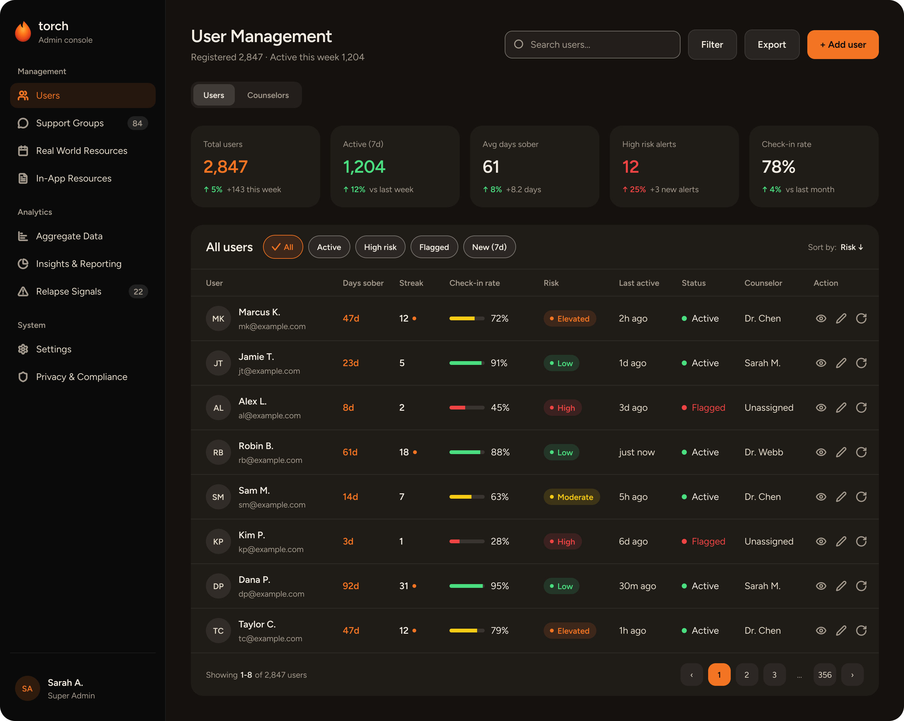
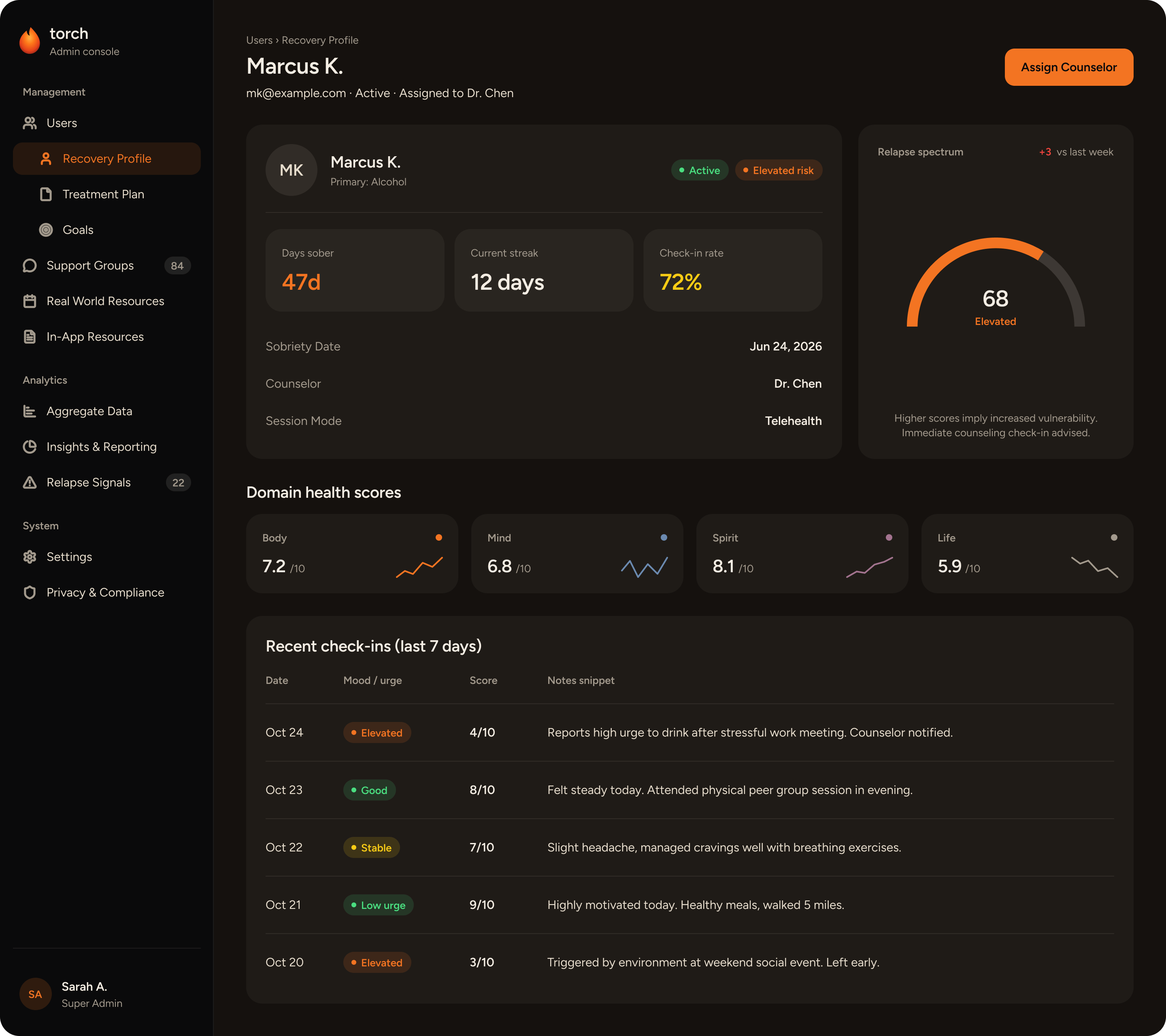
Counselors and admins get a separate web product on the same system, tuned for desktop density: a member table with risk, check-in rate and status; a member's recovery profile with domain scores and recent check-ins; an edit-counselor form; and an insights page that surfaces patterns from de-identified data. Pillar colours stay on pillars and status colours stay on status, so a red or orange chip always means the same thing across both products.
The design system
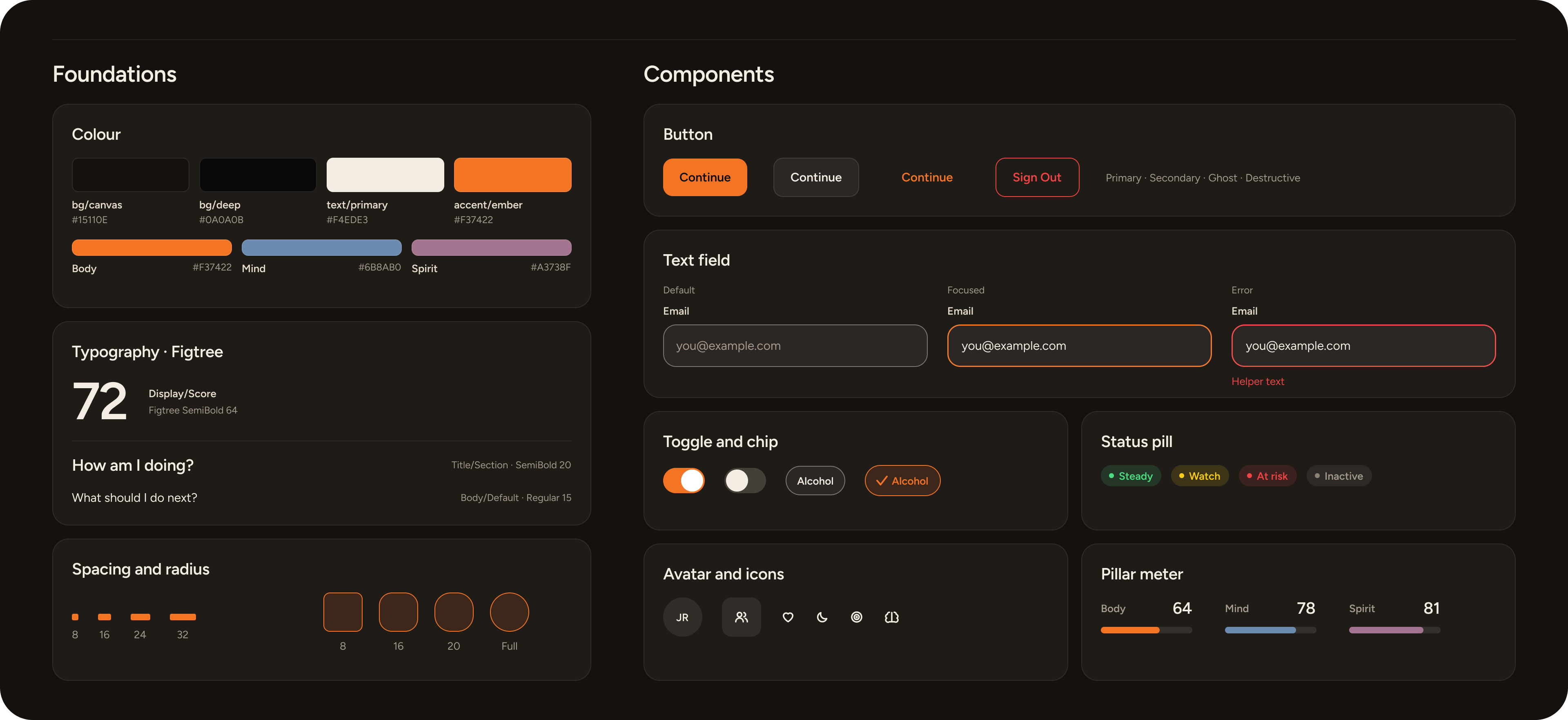
Both products run on one token-based system: 39 colour tokens, including six tints with the opacity built in, 11 text styles, a spacing and radius scale bound to every layout, and shared components including list rows, chips, status pills, toggles, avatars, icon boxes and an icon library.
| Text token | Contrast on the background | WCAG AA |
|---|---|---|
| Primary | 16.16 to 1 | Pass |
| Muted | 6.76 to 1 | Pass |
| Accent (ember) | 6.56 to 1 | Pass |
| Danger | 4.99 to 1 | Pass |
| Spirit | 4.83 to 1 | Pass |
Handoff
- Touch targets. 44 by 44pt on iOS and 48 by 48dp on Android. At least 24 by 24px on the web admin, even where the icon is 18 to 20px.
- Text scales with the user. The app follows the system text size on iOS and Android, and the web admin uses rem units. Layouts reflow at 200% text and at 320px wide without sideways scrolling.
- Native chrome on both platforms. Built in Flutter, the app uses each platform's real status bar and system navigation and keeps content inside the safe area. The tab bar sits above the home indicator on iOS and the navigation bar on Android.
- Motion is optional. With Reduce Motion on iOS or Remove animations on Android, the voice waveform and screen transitions fall back to a static state or a simple fade.
Results
Torch hasn't launched yet, so these measure the design work rather than usage:
- About 100 screens: 80+ in the mobile app for iOS and Android, and 16+ in the web admin console.
- 11 text styles and 39 colour tokens, one system shared by the mobile app and the admin console.
- All 463 auto-layout gaps and 299 corner radii bound to variables, so any spacing or radius change is a single edit.
- Component instances on the screens grew from about 100 to about 175 as one-off frames became shared components.
- Every text pair passes WCAG AA, with the lowest at 4.83 to 1.
Usability testing results
In moderated task-based testing with 8 participants (both clinicians and recovery peers) on the high-fidelity prototype:
- 100% crisis pathway discovery. Every participant located and triggered the 988 crisis route in under 3 seconds from anywhere in the app, validating the fixed, single-tap safety requirement.
- 12-minute average intake. Conversational voice onboarding was completed in an average of 11.8 minutes with zero session abandonment, compared to estimated 25+ minutes for traditional paper/web forms.
- Under 20-second counselor triage. Counselors successfully identified at-risk members needing session prioritisation across a 30-member roster in under 20 seconds.
Next: clinical pilot roll-out with partner treatment facilities and beta release on iOS and Android. The numbers in the interactive demo above are sample data.