Finsteps
A money-skills app where students learn in short lessons and then practise real decisions with a budget of their own.
- Role
- Product and UX design across the student app, parent app and school web portal
- Platform
- iOS and Android apps for students and parents, plus a web portal for schools
- Status
- Live on the App Store and Google Play
- Users
- School students, their parents, and teachers and school administrators
Overview
Learning money by practising it.
Finsteps is a financial literacy platform for school students. Short lessons and quizzes teach the concepts, and a simulated money environment lets students practise them: earning rewards, tracking spending, saving and making purchase decisions. Parents guide the learning at home, and schools run the programme and its rewards.
The money is virtual. Finsteps is an educational simulation, not a banking app, so the design had to make practice feel real without ever looking like banking.
Who it serves
- Students, the primary users. They need to understand money, practise decisions and stay motivated. They get interactive lessons, quizzes, virtual balances, tasks, rewards, streaks and milestones.
- Parents and guardians. They want to guide their child's habits and see progress. They assign and review tasks, approve purchases, send gifts and appreciation, and read learning reports.
- Teachers and school administrators. They connect financial learning to school life. They manage students, parents and classes, set reward rubrics and communicate from a web portal.
The design challenge was connecting the three: learning that turns into real decisions, with the right amount of adult visibility at each step.
Parent app
Guides habits at home
- Assigns and reviews tasks
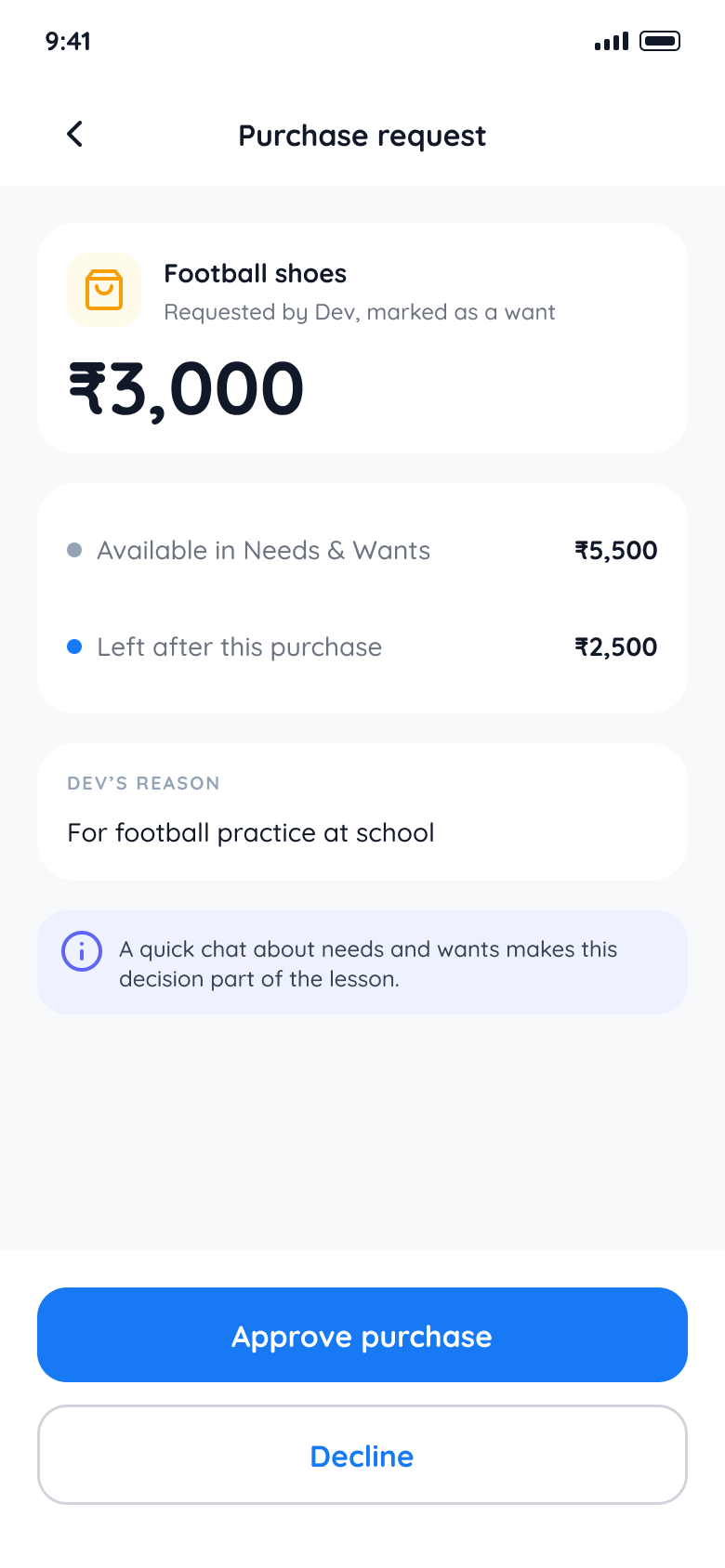
- Approves purchases
- Sends gifts and appreciation
- Reads learning reports
Student app
Learns and practises
- Lessons and assessments
- Virtual balance and pots
- Rewards, streaks, milestones
- Purchase requests
School portal
Runs the programme
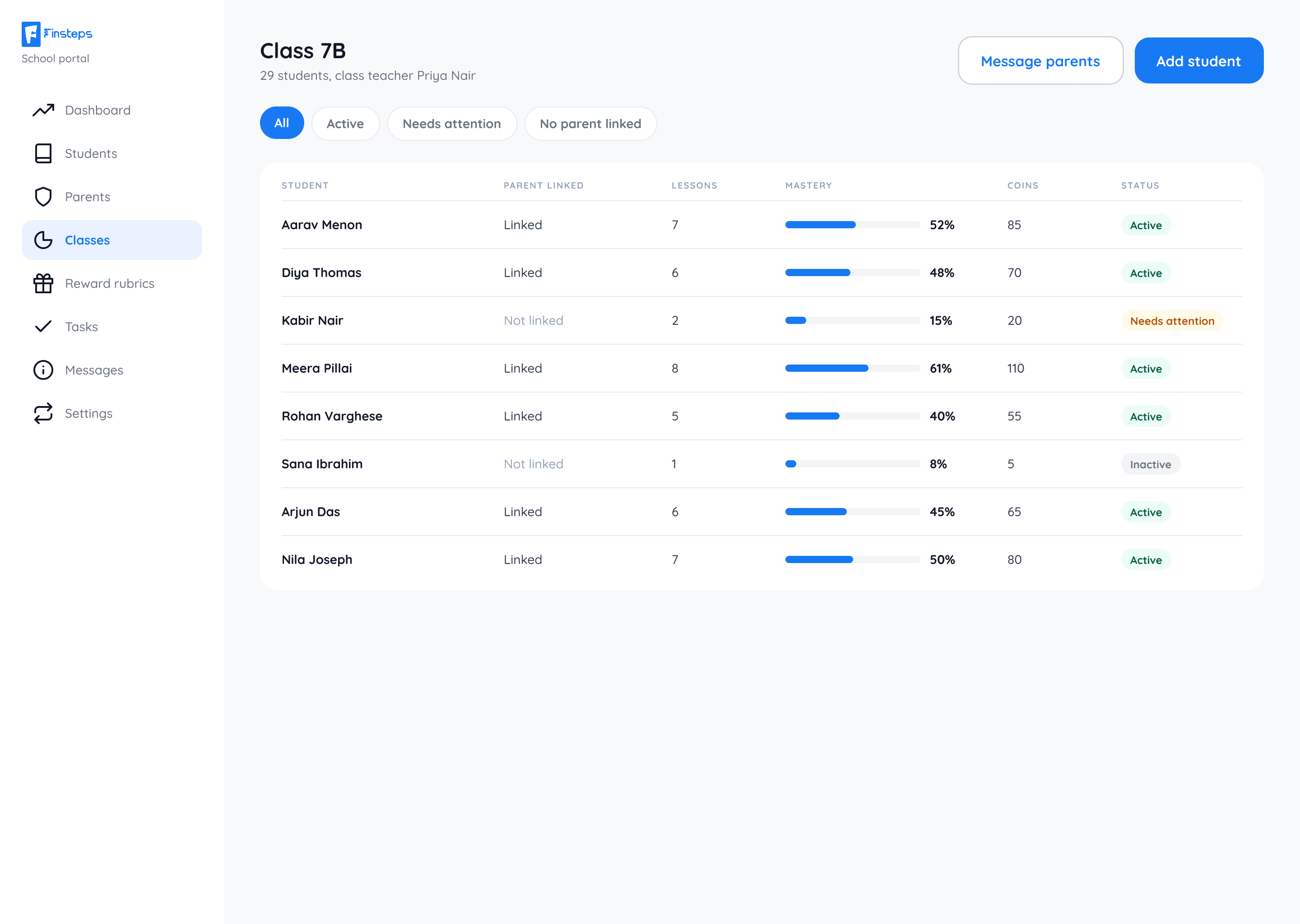
- Manages students and classes
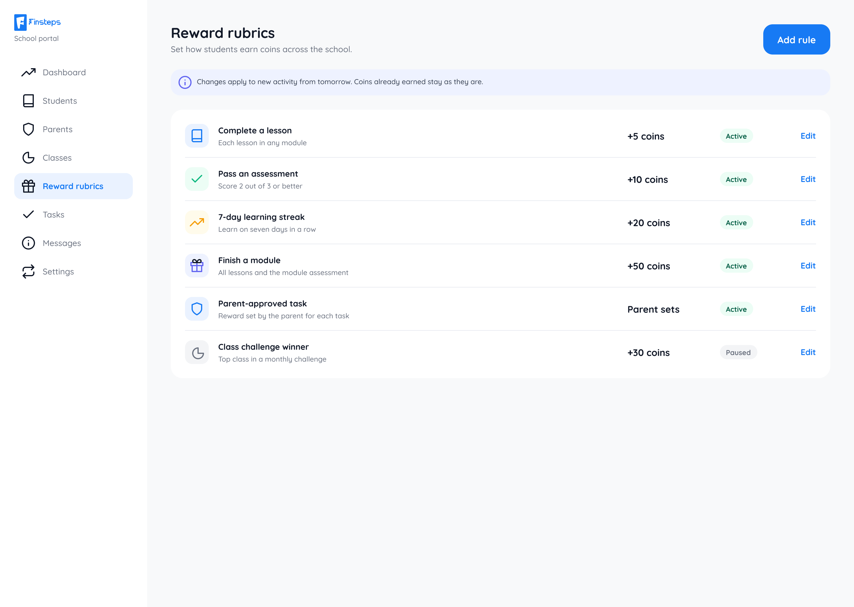
- Sets reward rubrics
- Messages parents
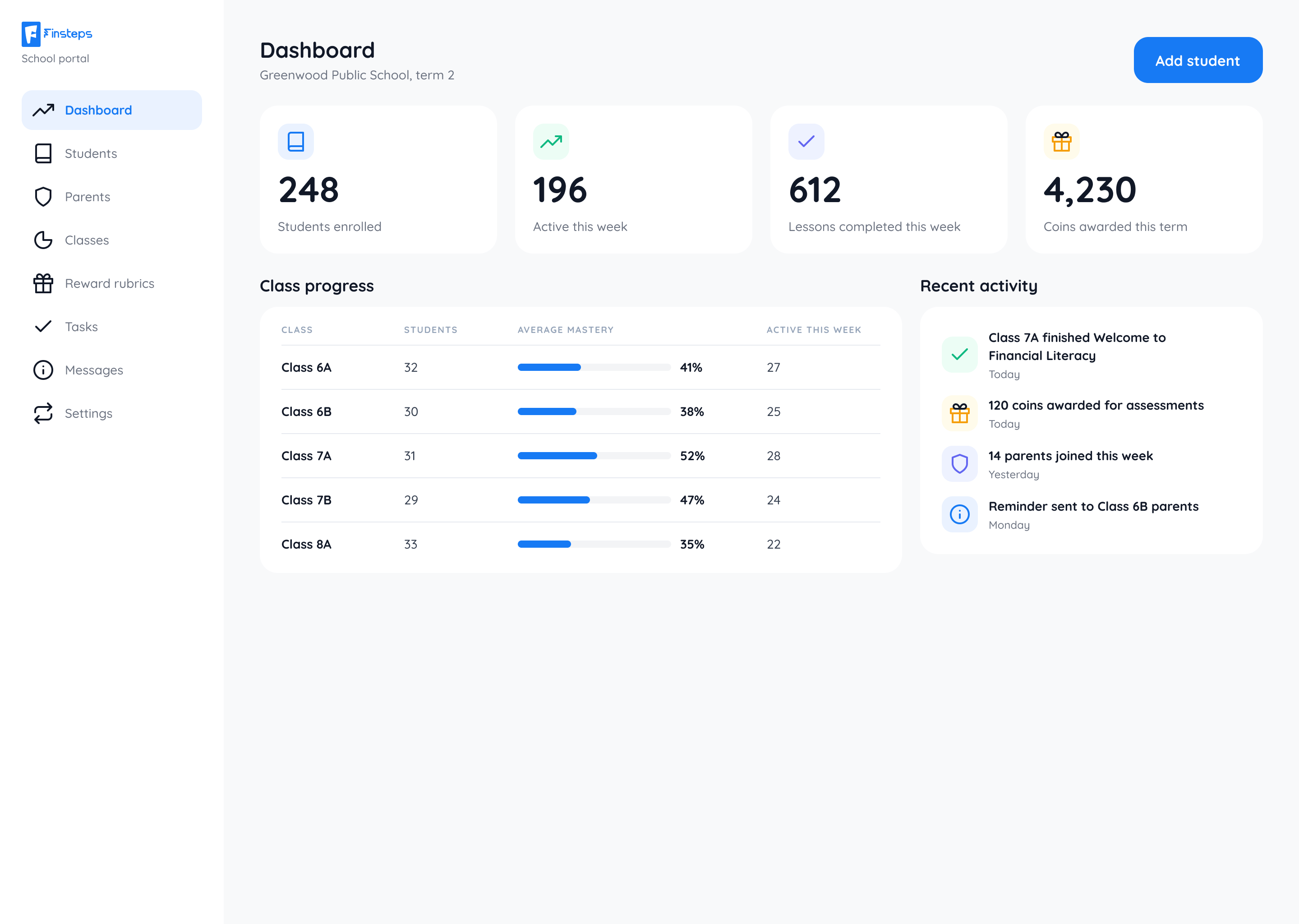
- Tracks class progress
Research
I worked from interviews, a competitive analysis and user testing with students and parents. Three findings shaped everything:
- Students respond to gamification: streaks, badges, coins and visible progress.
- Parents value transparency, but only when it doesn't overwhelm them.
- Clear language matters more than anything else on a screen about money.
That produced three working personas: a 12-year-old who wants to learn money management and finds banking boring, a 10-year-old who wants to earn coins and clear rewards, and a parent in their forties who wants to monitor spending but has little visibility.
Usability testing insights
Testing the initial prototypes with 8 students and parents highlighted two critical friction points:
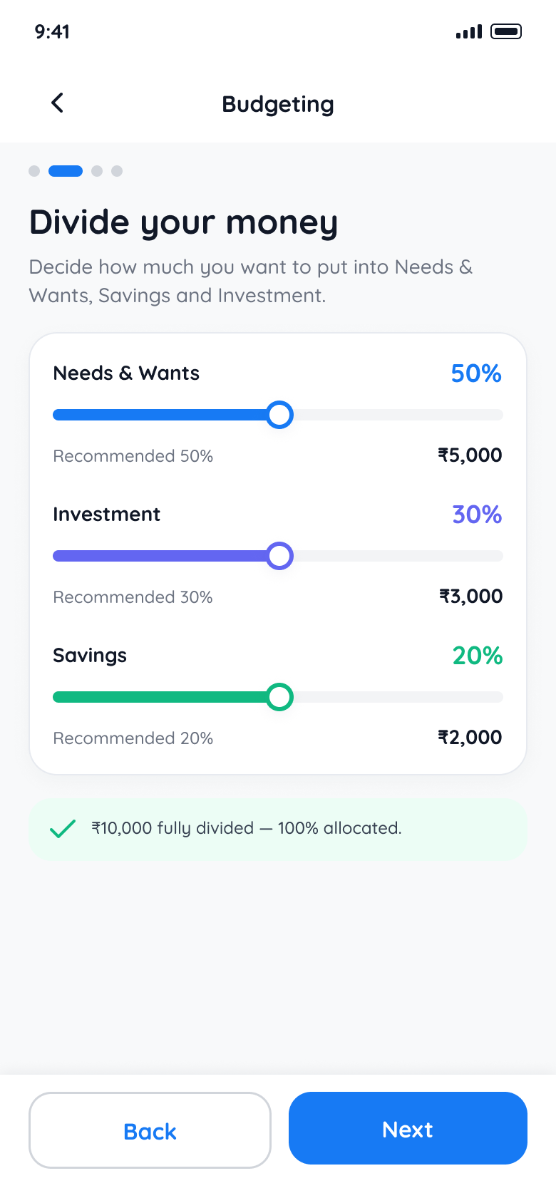
- Budget allocations were too abstract for younger students. When students were asked to split earnings using percentage sliders, 10-year-olds hesitated. We replaced percentage sliders with tangible goal envelopes and visual coin stacks, which made dividing funds intuitive.
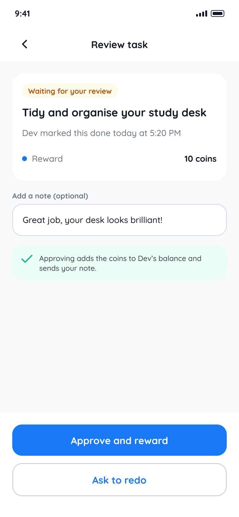
- Parents needed fast approval loops without micro-management. Earlier parent views required inspecting every item breakdown before approving task rewards. We replaced multi-step forms with a one-tap review card, reducing approval friction and keeping student streaks alive.
Principles
- Kid-first. Colourful, playful, never intimidating.
- Clear hierarchy. Simple language and visual emphasis.
- Gamification. Streaks, badges, coins and progress.
- Parental guidance. Transparency without overwhelm.
- Accessibility. Large targets and readable type.
Three connected journeys
The product is easiest to understand through three journeys that cross the student and parent experiences.
Learn, answer, earn
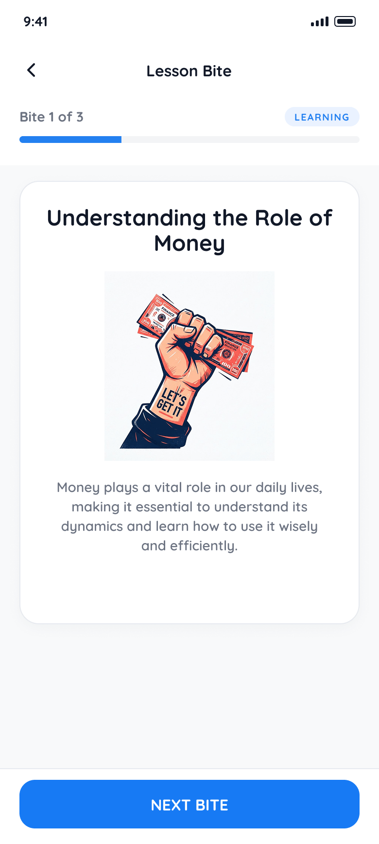
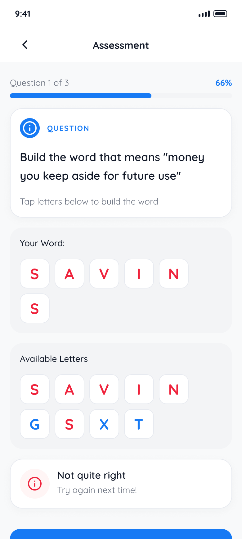
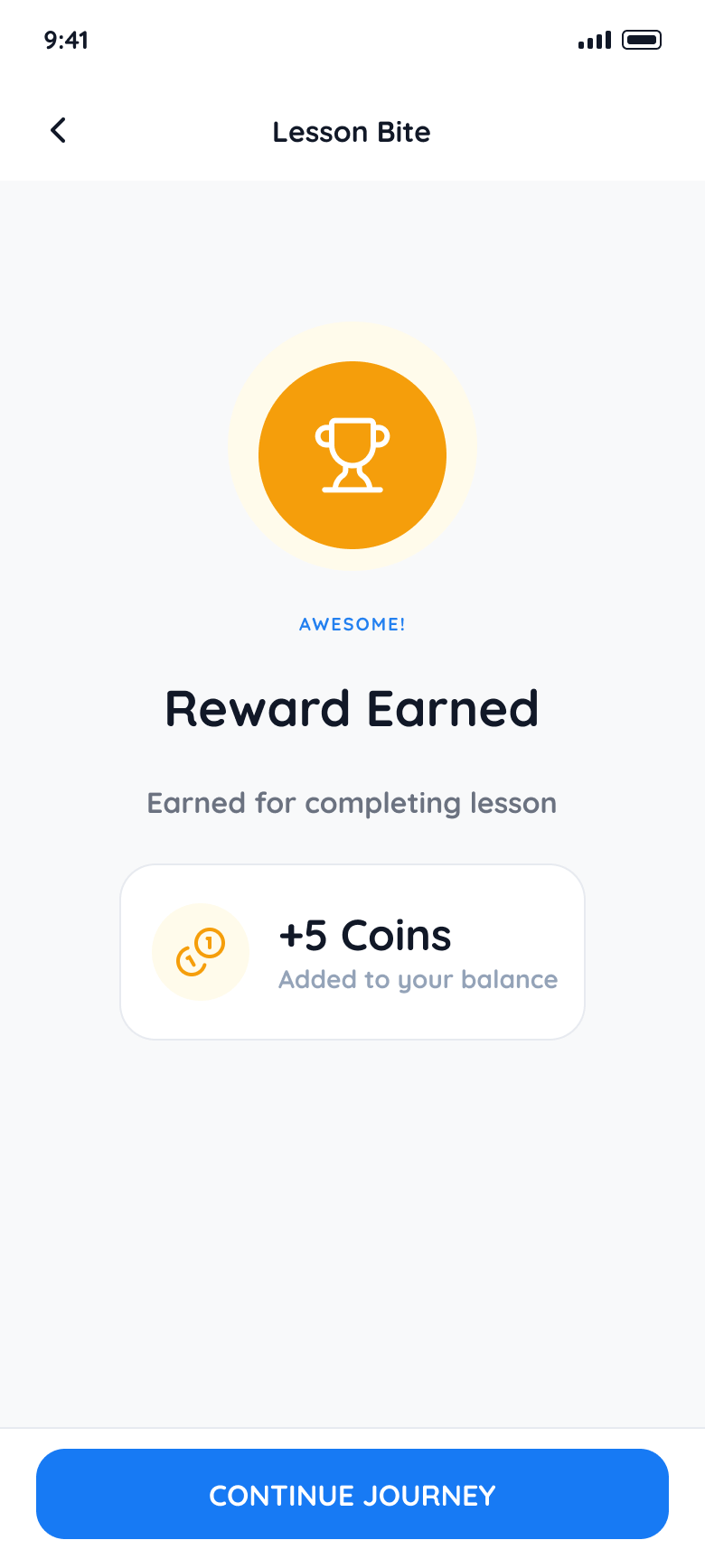
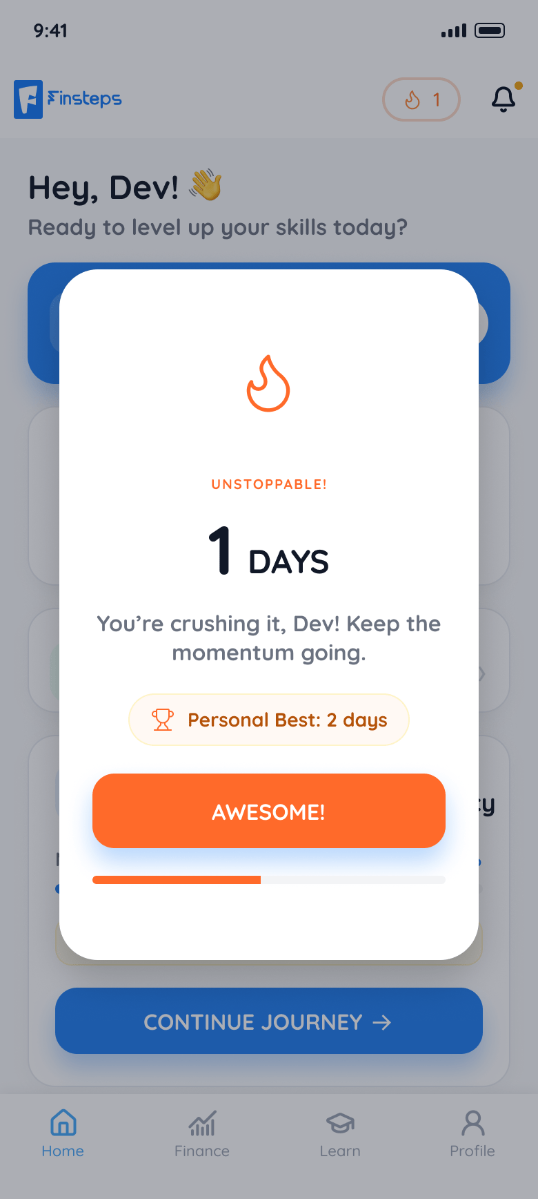
A student finishes a bite-sized lesson, answers a short assessment, gets feedback on each answer and earns a reward. Streaks and milestones bring them back the next day.
A task from home
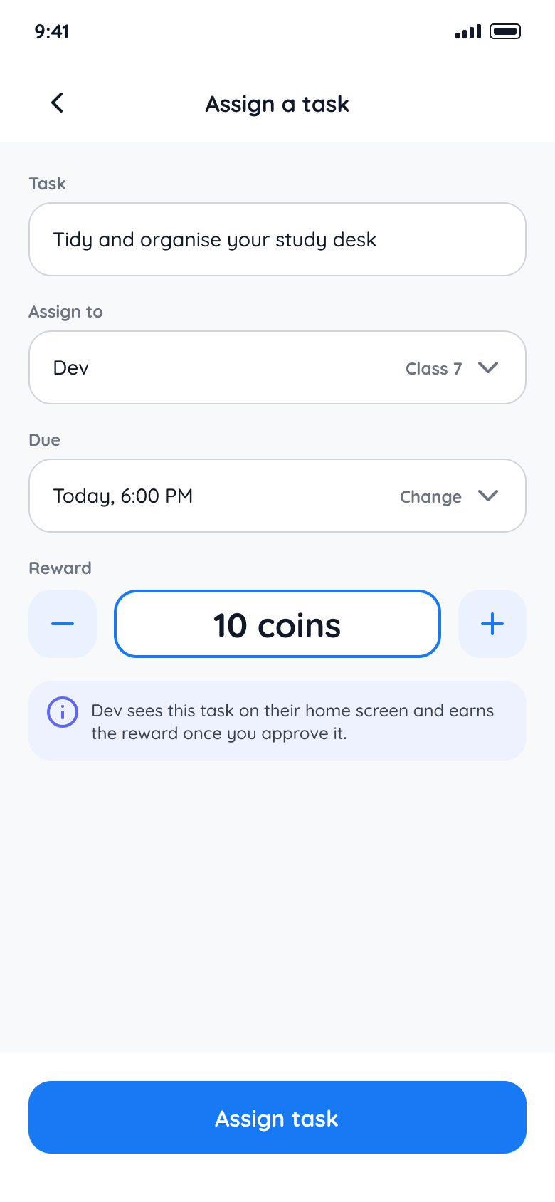
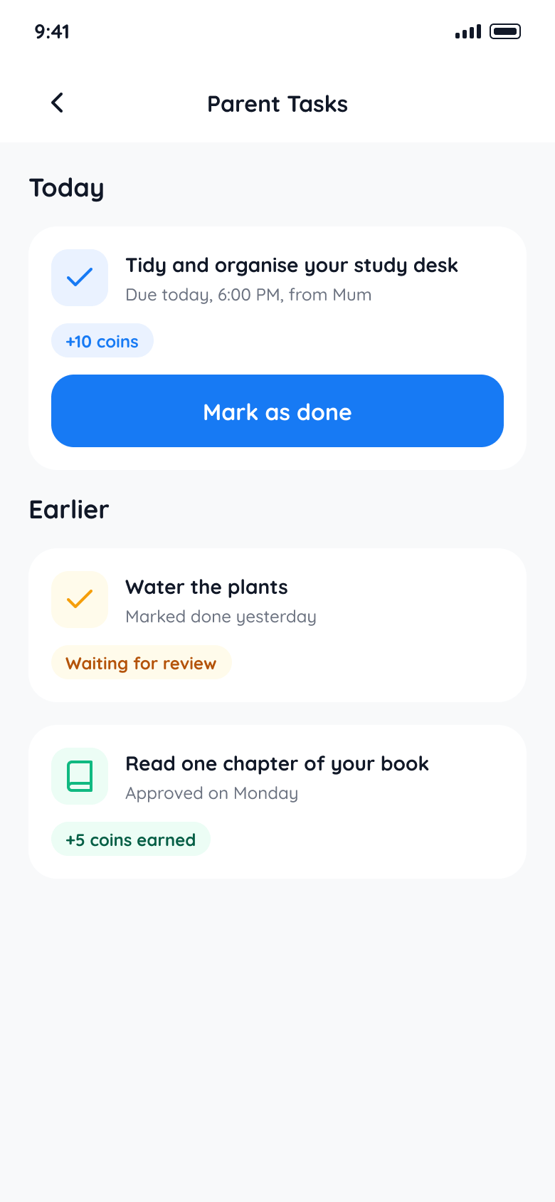
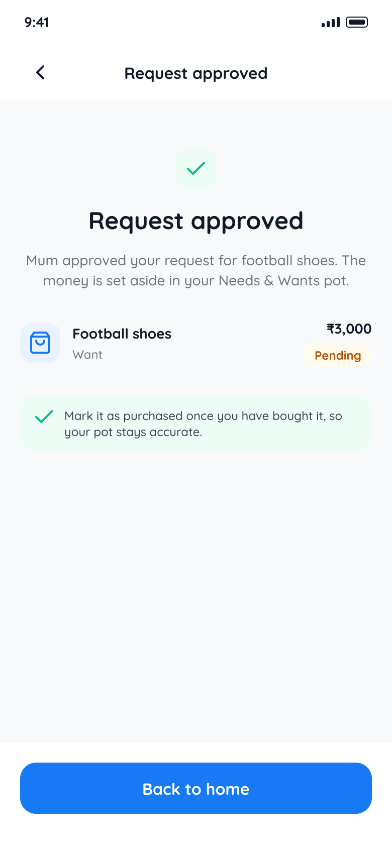
A parent assigns a task, the student marks it complete, and the parent reviews it and rewards the effort. Everyday responsibilities become a way to earn, with the parent in the loop.
Asking before buying
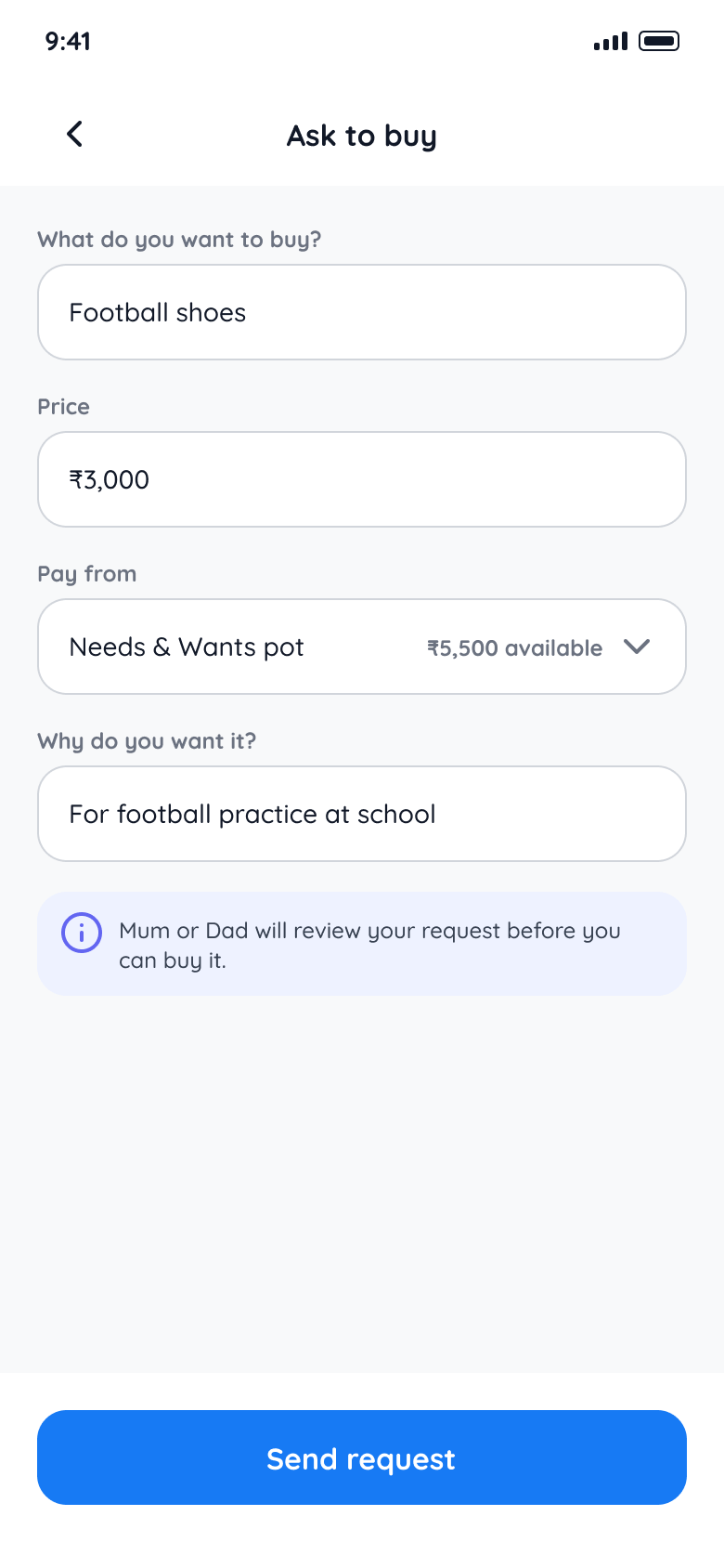
A student requests a purchase, and the parent approves or declines it. Spending becomes a conversation, not a surprise.
Decisions
A tutorial that teaches by doing
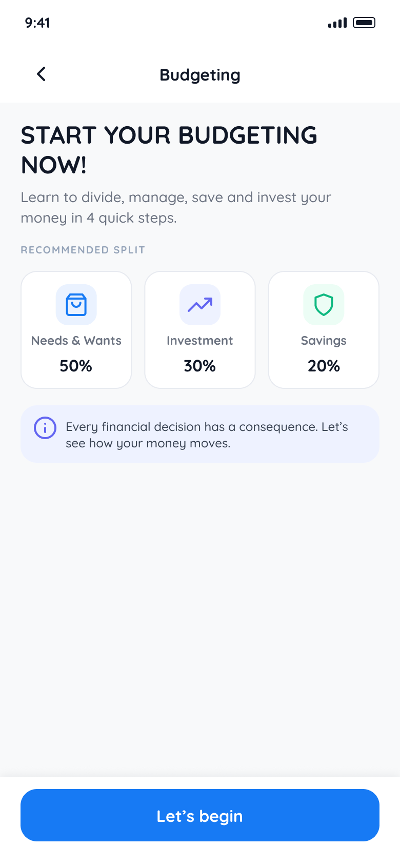
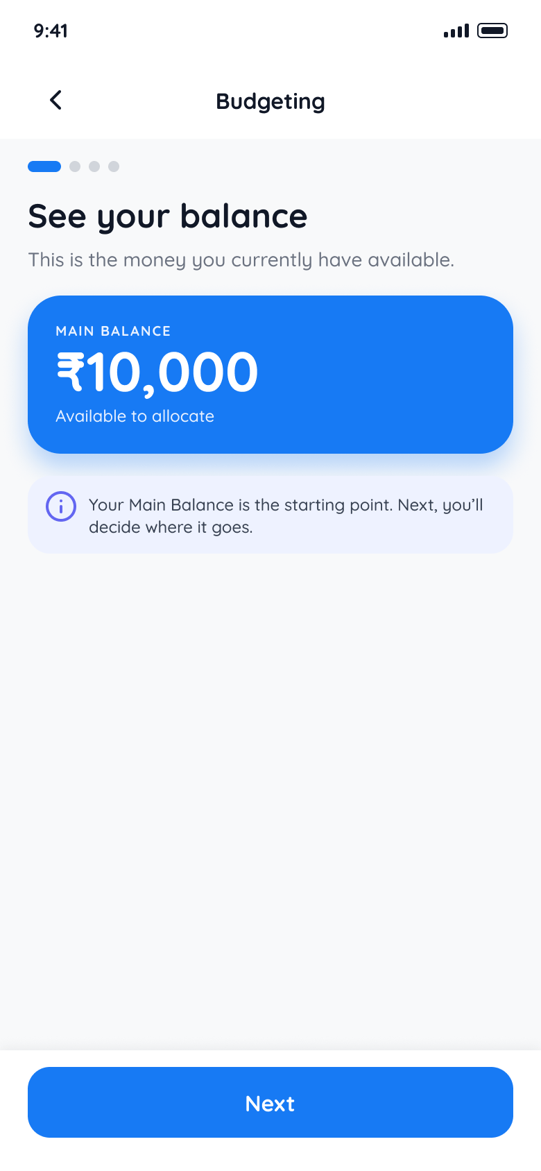
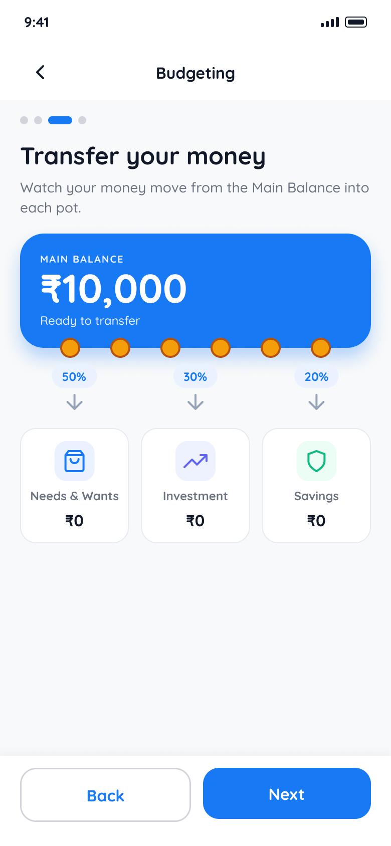
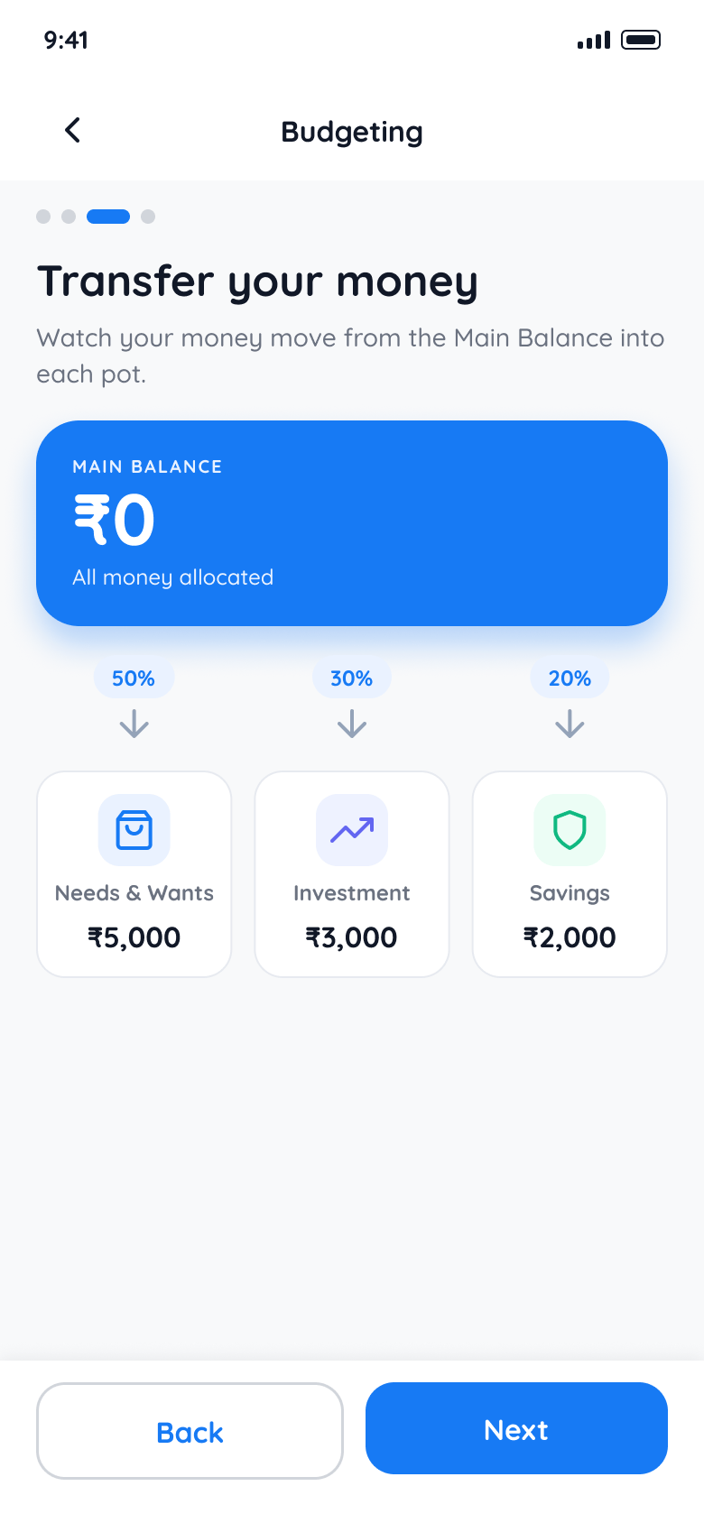
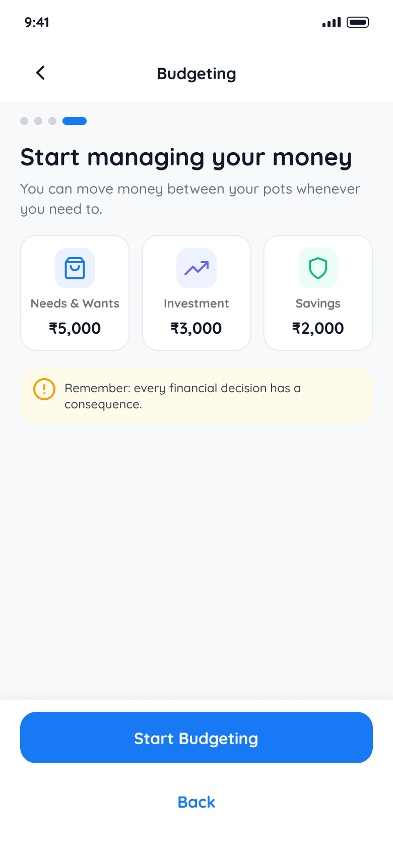
New users meet the money tools through a six-screen walkthrough, each step a real action on a real screen, not a slideshow.
- WelcomeWhat you will learn
- BalanceSee what you have
- AllocateSplit it into pots
- TransferMove money, then confirm
- DoneSee the result
- Start managingUse the tools for real
Numbers that explain themselves
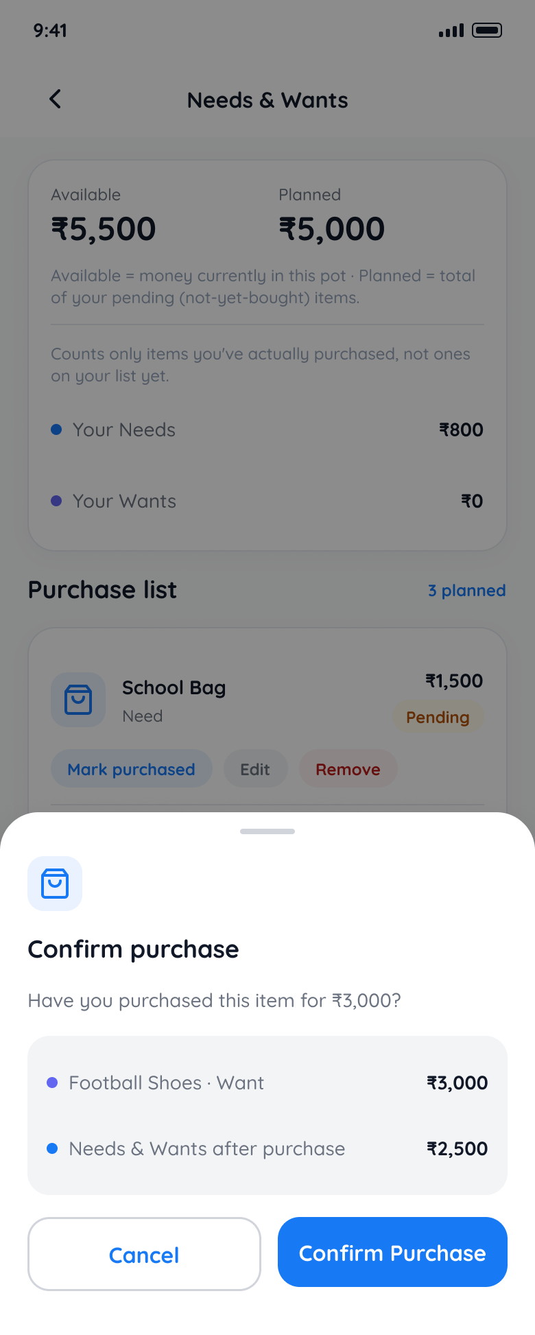
On Needs and Wants, the screen says what each figure means right where it appears: available is the money in this pot, planned is the total of your pending items, and the counts only include things actually bought. Try the demo above.
Designing the failures
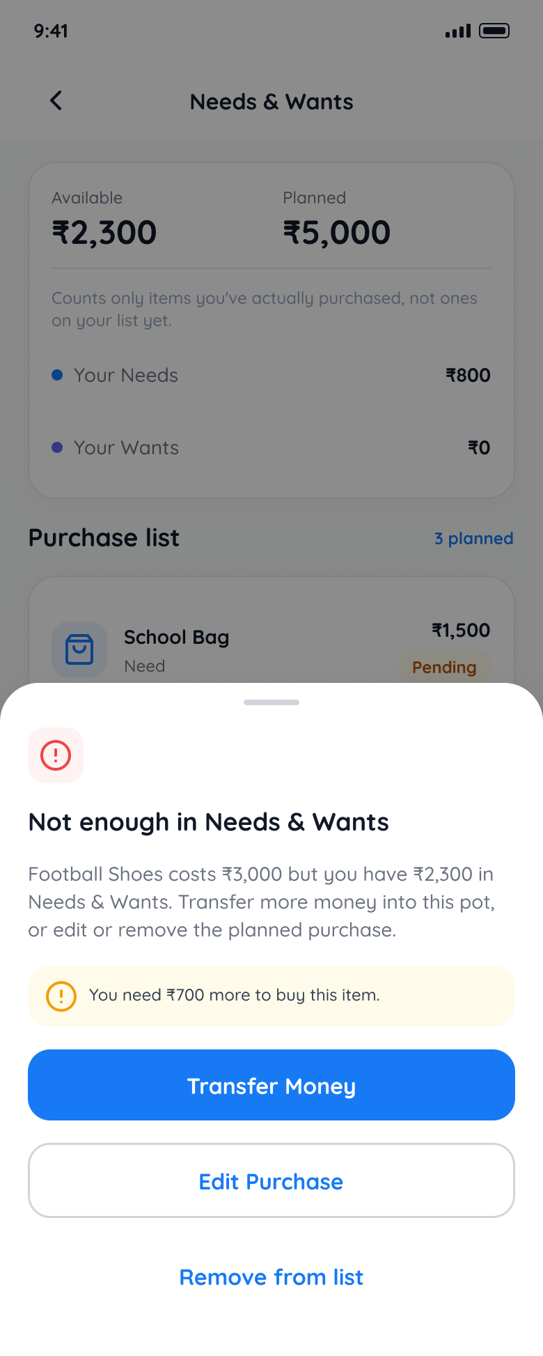
Buying something you can't afford is part of learning about money, so the flow includes a confirm step, an insufficient funds screen that explains what to do, and a clear record once a purchase is made.
Guidance without monitoring
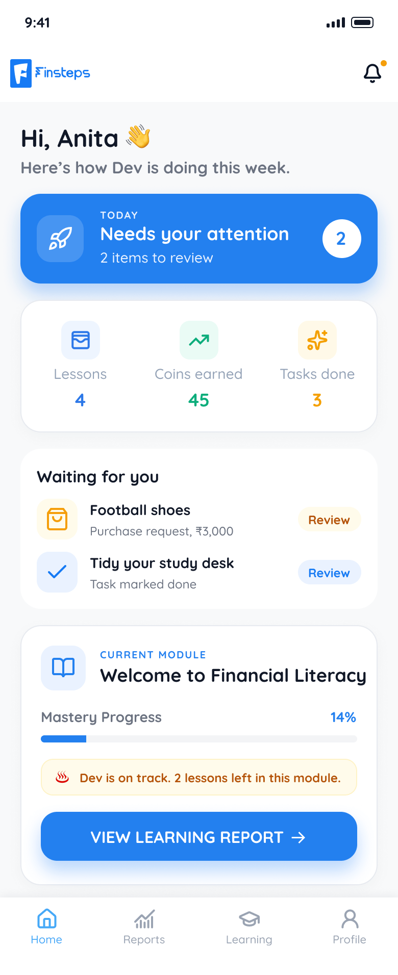
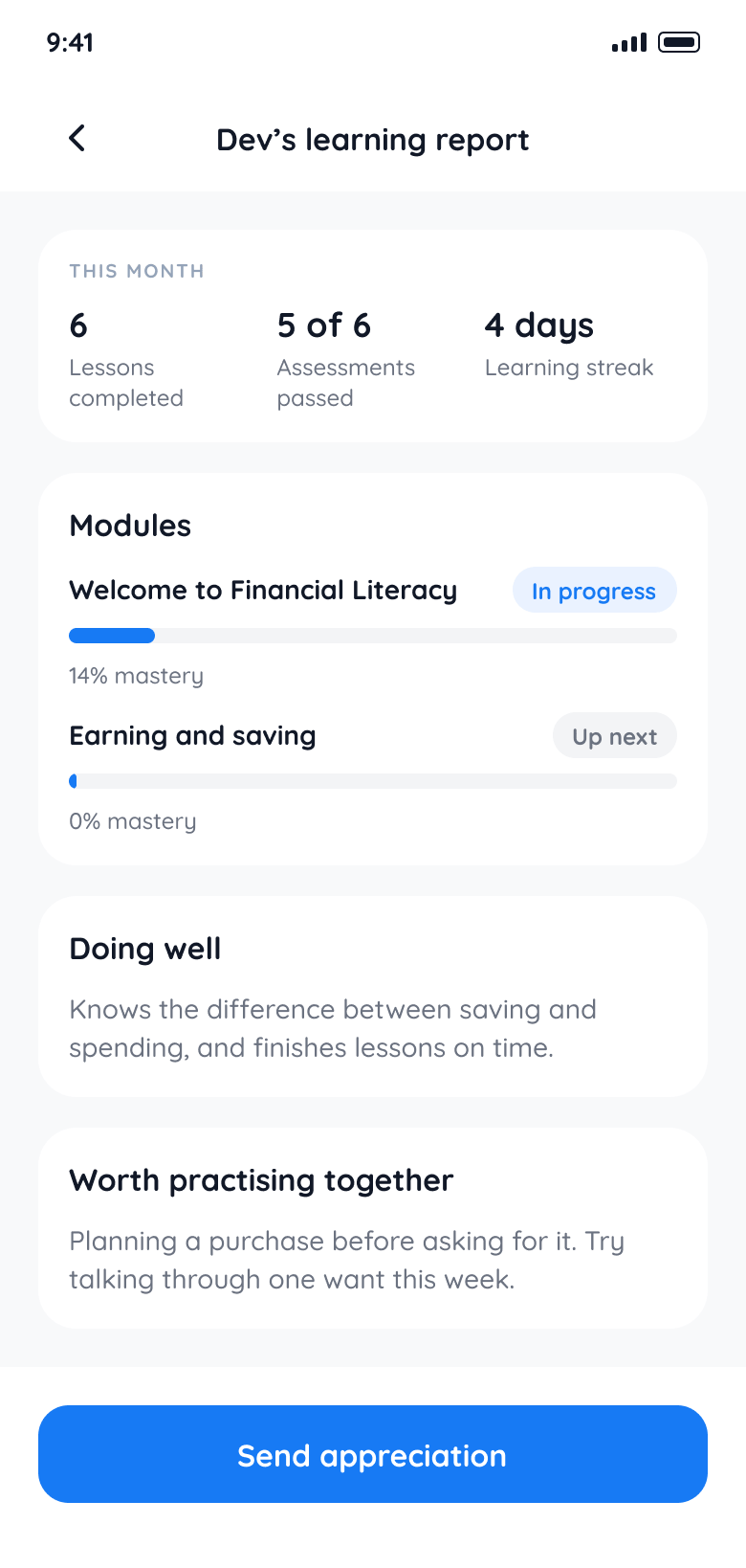
Parents get learning reports, task reviews and purchase approvals in their own app, so they can guide their child without watching every detail.
The school portal
Teachers and school administrators work in a desktop web portal with dashboards, student, parent and class management, reward rubrics, tasks and communication. It connects the classroom with what students practise in the app.
Design system
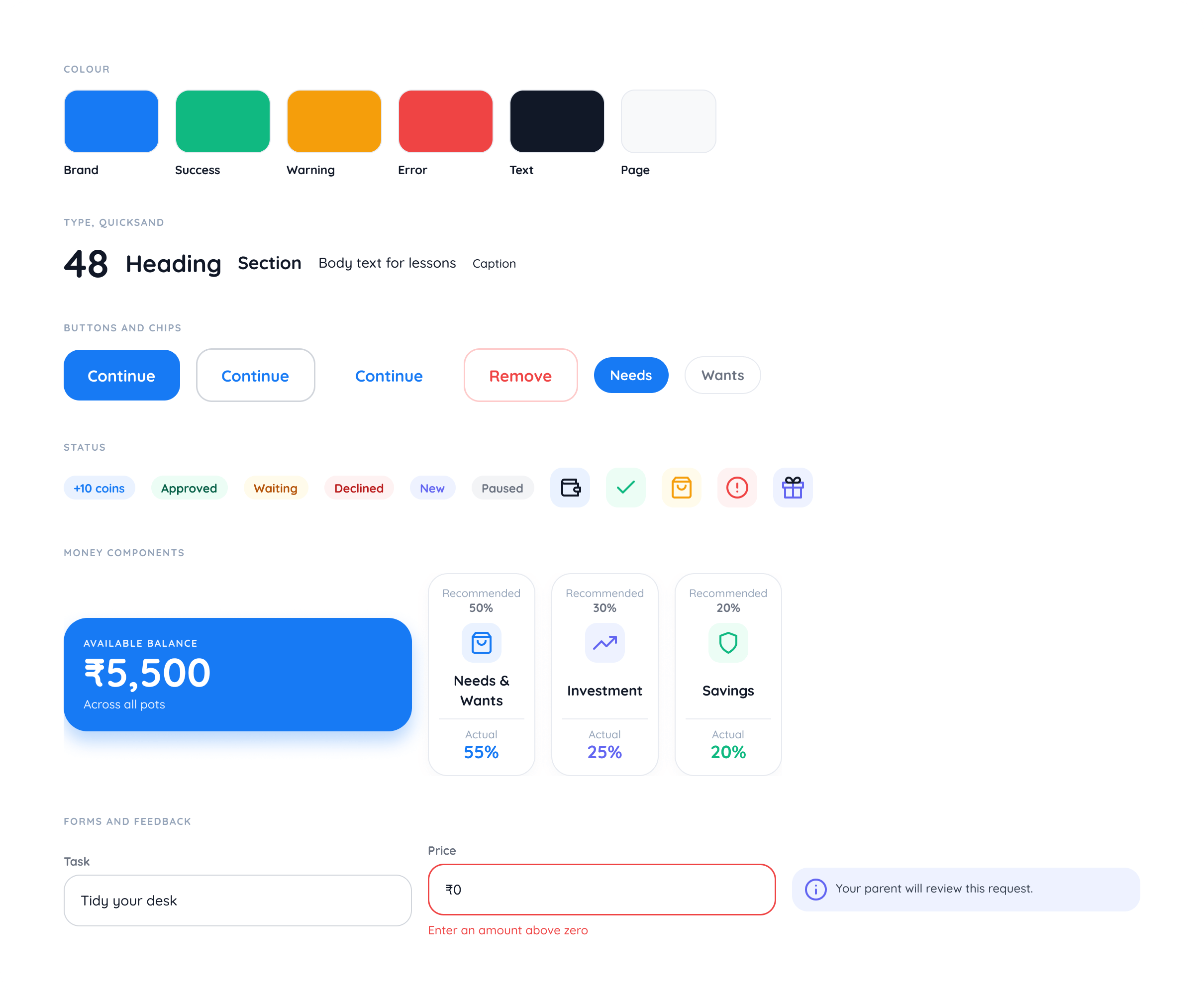
A component library on tokens, with spacing and radius tied to the token scale and a colour-coded palette: blue for primary actions, green for success and orange for warnings. Large touch targets and readable type suit younger users.
Results
- Live on the App Store and Google Play.
- Student and parent apps for iOS and Android, plus a school web portal, designed as one connected product.
- Usability tested with 8 students and parents, with the findings applied to the design.
- A token-based component library for the mobile apps.
Designing across students, parents, and educators taught me that a multi-sided ecosystem only succeeds when each audience receives an experience tailored to their mental model: playful and gamified for children, transparent and low-friction for parents, and structured and efficient for teachers. The central design challenge was balancing kid autonomy with parental guidance so oversight feels collaborative rather than surveillance. Next, I would track cohort retention across live app updates to evaluate which reward loops build the most durable saving habits over time.